jean cannella

design • art direction • illustration

Disney ABC Television Group Responsive Site Design

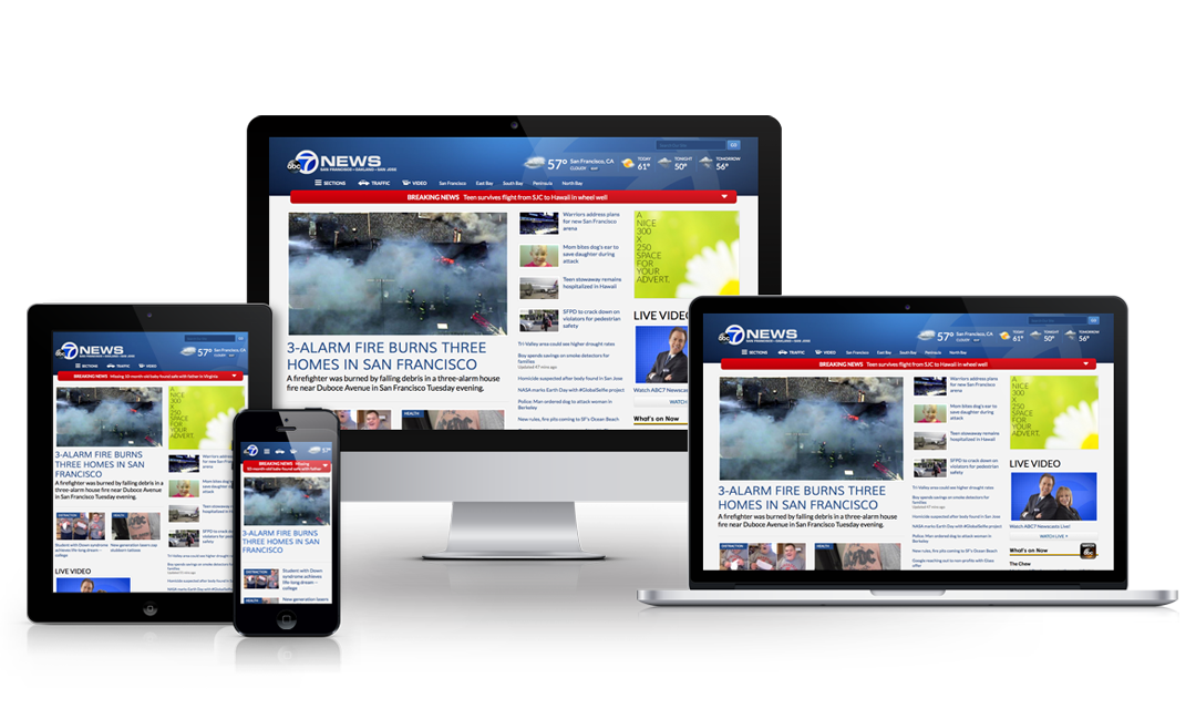
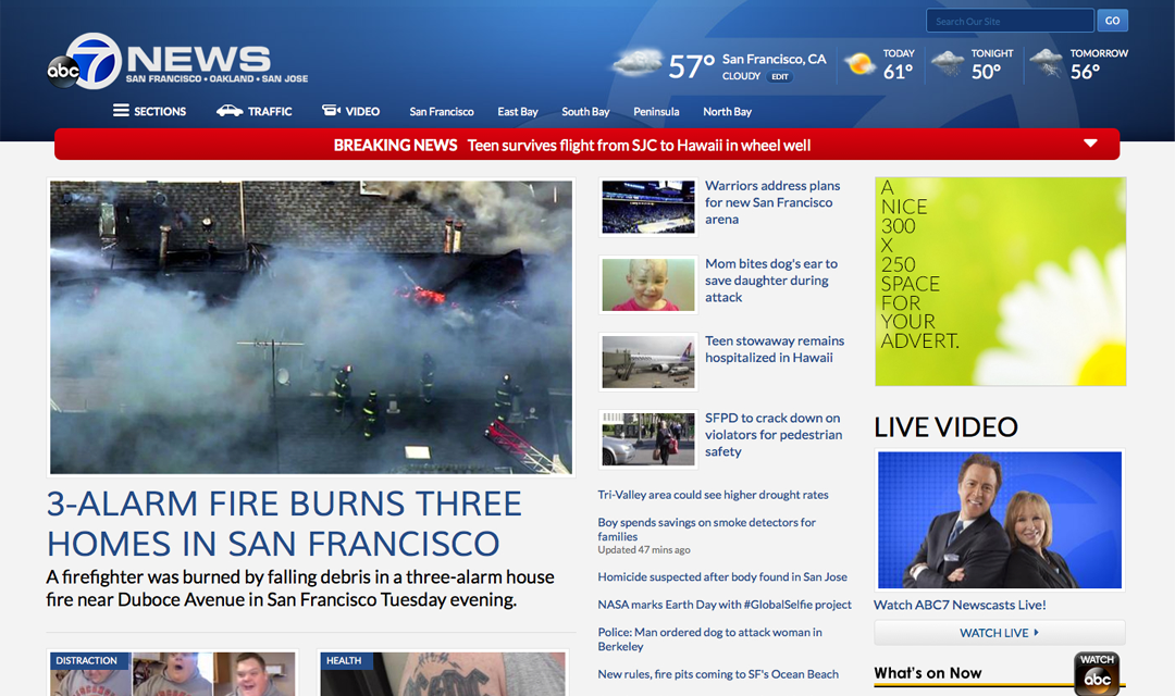
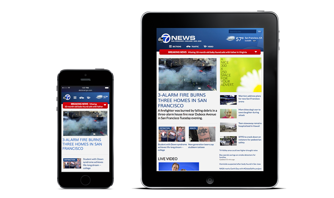
The eight Disney owned ABC local news stations successfully launched in May 2014. The process from the initial conception to the final product took 18 months. The design and development group pursued a "mobile-first" approach and took an agile based iterative design process which allowed the group to build the sites collaboratively. The concept phase involved weekly, sometimes daily brainstorming sessions among the development team and major stakeholders including: designers, product managers, station managers, sales teams, content editors and user input.

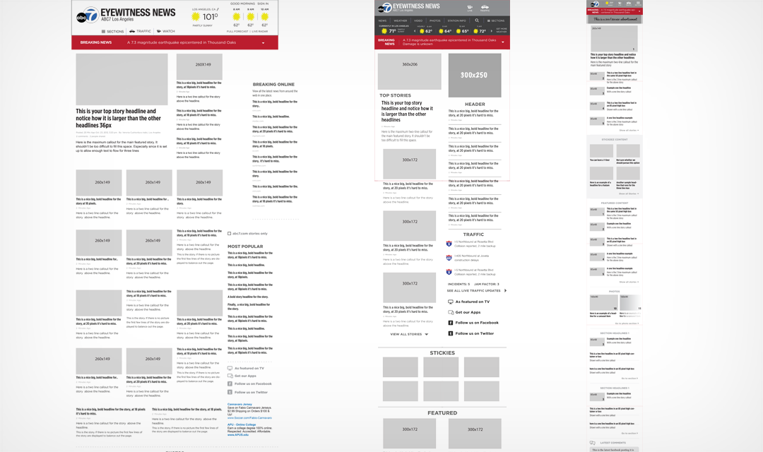
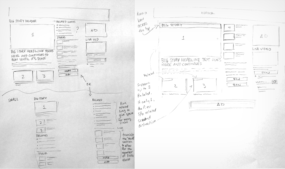
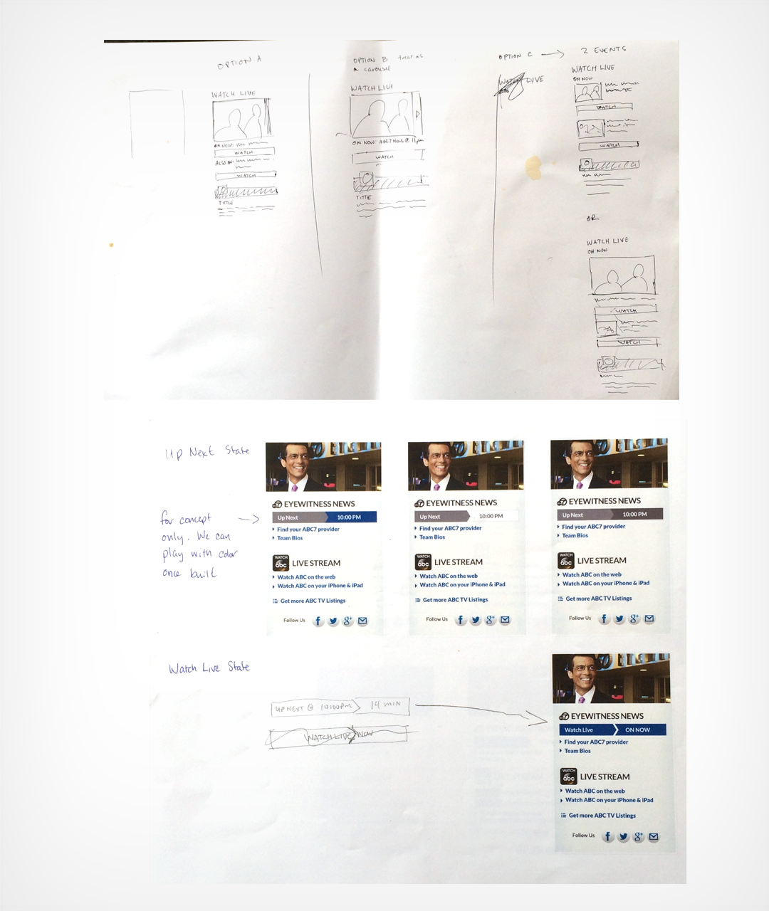
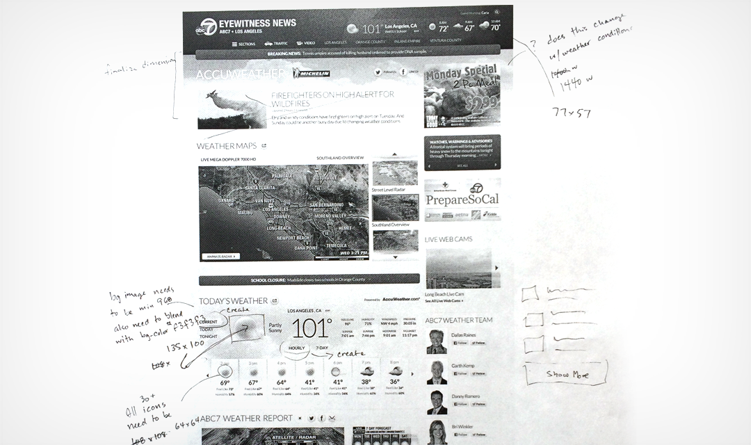
The sites took their early shape in the form of iterative sketches before developing more detailed wireframes. At each step the ideas were tested to determine the strength of the designs. This process was repeated until the entire group was satisfied with the wireframes then high fidelity photoshops were produced, modified and tweaked until it was determined the design was ready for production.


abc otv family portrait
Disney | ABC Television responsive site design (showing KGO-TV, San Francisco).

KGO home lg
Close-up view of KGO San Francisco's new homepage (shown here in the large desktop mode).

Wireframes of the 3 sizes
Examples of wireframe fidelity for the 3 major breakpoints; desktop, tablet and mobile phone. KABC is depicted here and shows an alternative header type for the tablet size that was later modified in favor of another version which can be seen on the final image below.

detail sketches for a major story
An example of the iterative sketching process showing ideas how to present a "big story" news event.


detail sketches to hifi mock-up
The relationship between an iterative sketch and a high fidelity mock-up.

Kine tuning a weather page
Another example of the fine tuning which took place during the process. Shown here, are notes ona number of items including: color modifications, image sizes, spacing modifications, and alternative interactions made on a print out of the actual site during its development.

phone and tablet views
The mobile phone and tablet versions of the new site. Here you can see how the header on the tablet version resolved.